algorithmic modeling for Rhino
Popular physics, biology and geology books often sport beautiful covers, but all the mathematics and programming are not-actually-visually-offensive at best but more often just plain ugly.
Have you ever come across a maths book with a gorgeous cover design?
This is the best one, by a mile, I could find in my bookcase, which is a sad state of affairs:
Views: 2334
Replies to This Discussion
-
Looking at my library, I think the usual practice is to abstract some diagram from inside and have a graphics designer jazz it up a little with some color fields. That seems to be de rigueur with Dover books. If it's a mandatory textbook, I guess they figure you don't care and they don't care.
-
-
Hi Peter, I appreciate the effort, and of course acknowledge that tastes do differ, but those all look pretty horrible to me.
- Financial Modeling is a bog-standard textbook cover, nothing about it makes me want to look inside.
- Princeton Companion is terribly crowded plus I dislike sideways text.
- Euclid's elements has the look of a self-published book by someone whose only installed program is Word.
- Conics is messy, the most striking feature of the cover is the glare/flash which is also the most irrelevant. I do appreciate the special O in the title though, that's a nice touch. Otherwise the typeface usage is far too undisciplined.
- Geodesics; same typeface mess. "THE GEOMETRY OF" is a serif font, "GEODESICS" is not. Plus the faint partial image in the background is quite off-putting as well.
I did find a cover that I somewhat like while Googling the above:
Old-fashioned, sure, but crisp.
-
-
Some decent attempts here Alex. 'General relativity' seems a bit cheesy to me. I don't like the way the wormhole wires just stop, makes it seem like a vase rather than actual space-time. Also the author's name unbalances the design by being the only thing on the left side of the drawing.
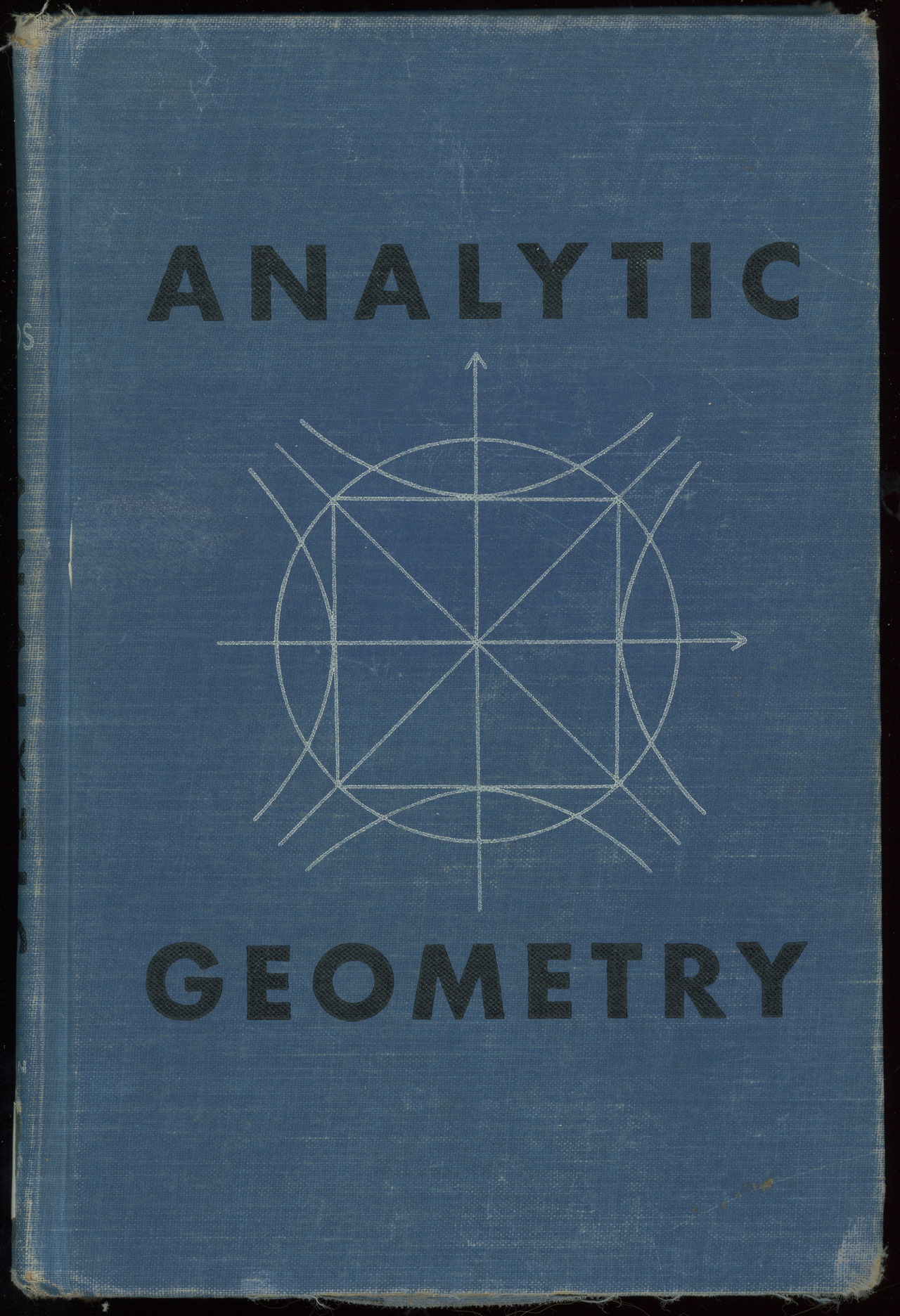
Геометрия is clean. Well balanced design, although the actual triangles themselves do not entice me. Same is true for 'Analytic geometry'. Balanced, clean, but boring. We've all seen rectangles, circles, diagonals and hyperbola before.
'Plane algebraic Curves'... hmm not sure. The drawings are interesting, but the font choice for the title, ugh. Just look at that 'g', the loop totally fails to balance the top. And that 'i'.... <shiver>.
-
-
Hmm, the elements use what I like to call the clown-palette (all primary colours together).
'Solid Shape' is ok I guess, still messy though.
'laws of form'.. really? A book with marketing quotes on the front? It has a good colour palette and I like the way the colours interact in the overlapping regions, if they'd gone with that strong approach and then resisted the urge to splatter blurb all over it it might have been nice.
-
-
Yes, the first genuine nice one! Consistent fonts, interesting drawing, good background/foreground separation and good background/foreground interplay. Consistency in the segmenting using clear but not demanding horizontal lines. Restrained colour palette.
Makes me want to buy a copy.
-
-
I agree. It actually managed to pull off a very loud palette.
-
© 2024 Created by Scott Davidson.
Powered by
![]()


